Unior hand tools conquer markets with a new look
Modern design, sustainability, and a new integrated graphic identity.

To refresh its corporate identity and give it a new, more modern and sustainable look, we have been recently developing and looking for solutions to present our brand in a more modern, functionally sophisticated and strategically oriented way. In addition to all the visual communications on the market, the comprehensive and updated corporate identity will also include a change in packaging. All with the aim of offering a better user experience, with an increasing focus on highlighting the product itself and optimizing warehouse and store space.
Keeping up with the trends and new guidelines dictated by an increasingly fast-moving market for everyday work is a challenge for many companies today. That's why we decided to present a fresh new brand image to the public, with updated packaging and a new corporate identity. Its modern look thus highlights many of the brand's key characteristics, such as quality, innovation, and good user experience. While the color palette remains mostly the same, with a few minor additions to make it stand out on the market, the corporate identity has been updated this time with several distinctive brand elements and a compelling slogan, Made for Work. However, modern trends are also turning towards the sustainability aspect, putting this first and foremost.
Modern and sustainable packaging for a compelling user experience
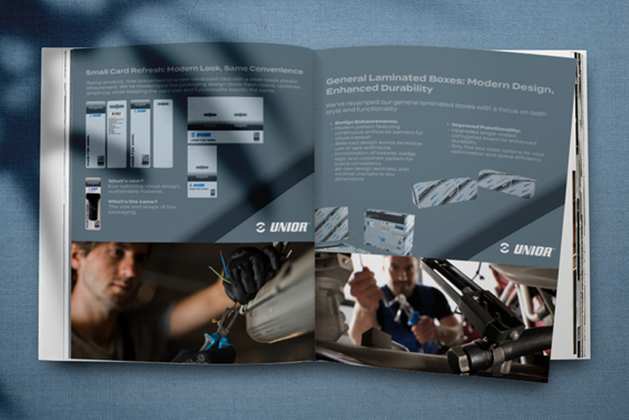
Recognizing that the look and feel of the packaging is also key to brand development, we have redesigned the packaging to add significantly more functionality and usability. In addition to clear and legible typography, a strategically defined color palette and other character elements, the focus is now on product presentation, in 3D. The closed packaging system, with the product clearly exposed, further enhances the user experience. The focus is on the information that is of most interest to the user, and the optimization of the packaging also reduces unnecessary use of space in warehouses and stores.
This is also an important aspect in the case of laminated boxes, where, in addition to storage optimization, there has also been an increasing focus on the durability and sustainability of the packaging itself, with the upgrade to single-layer corrugated board.
The guidelines for optimizing the size and shape of the packaging and the increasingly eye-catching design have also been followed in the case of the new cardboards card, where the product is once again at the forefront.


